The Handwriting of the Tudors
I previously blogged four posts analysing the handwriting of Richard and his contemporaries. For those who missed them before, here are some links link
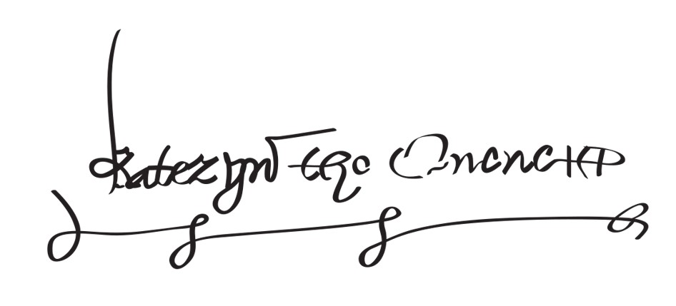
Signs of the Times – The Handwriting of Richard III
Signs of the Times 2 This deals with Edward, Edmund of Rutland, Elizabeth Woodville and Clarence
Signs of the Times 3 This analyses the writing of Buckingham, Margaret Beaufort, Henry Tudor and Elizabeth of York
Signs of the Times 4 This examines contempories including John de Vere, Warwick, James Tyrell and Francis Lovell.
However, I have never looked at the handwriting of the later Tudors, so I thought I’d give them a go.
Let’s start with Henry VIII and his wives!
Please bear in mind that a signature only has a limited amount of interpretation possible, and longer pieces of writing are required for more accuracy, but as this is just for fun…
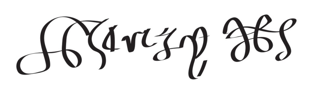
Above is Henry’s signature. The first thing I notice is that it slopes upwards from left to right. This shows that he was feeling positive/optimistic when he signed this.
There are three ‘zones’ in handwriting analysis (upper zone, where the tops of capital letters and tall letters like b, d, h, l, k and t pass into, middle zone, which all the letters pass through and some are entirely within, and the lower zone, where the tails of lower case g, j, p, q, y, z and sometimes f go) and to be well-balanced they should be of equal height.
Henry has a dominant middle zone. This shows he was concerned about everyday needs and practicalities (he loved his food) and enjoyed the luxury of being a king. It can also show that he needed immediate gratification.
The different slants on the letters, some leaning to the left, others to the right and some upright reveals he was moody and capricious, very changeable. There is also a tick mark at the start of the ‘n’ – a small lead-in mark – whcih indicates he could fly off the handle at the drop of a hat – you’d have to tread on eggshells around him.
There is a possible break in the tail of the ‘y’ (although it may be the printed version). Breaks in letters can indicate deficiencies or health problems in the corresponding area. In the tails of letters it refers to below the waist – so sexual organs and/or legs. We know he had an ulcerated leg, but maybe his difficulty in having a male child might have made him feel deficient in that area. It is also a very small tail, which suggests he wasn’t all that interested in sex. Maybe he saw it as a duty to beget an heir.
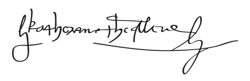
The above signature is of Catherine of Aragon, Henry’s first wife. My first impression is one of assurance; the writing looks fluent and the underline shows confidence. She was queen for a long time, so she would have been used to signing documents by then.
There is quite a dominant upper zone – the tall letters are very tall – which shows intelligence or a good imagination.
The communication letter ‘a’ is well-formed and closed, showing she was a good communicator and could keep a secret – perhaps this relates to her relationship, or not, with Arthur, Henry’s older brother.
The letters are generally slightly leaning to the right, which shows she was able to express her emotions and the words are close together, showing she liked being in the company of others.
There are some longish loops at the start and end, although I’m not sure what they are, but if they are by her, it shows a strong sex drive.
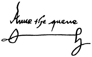
The one above is of Anne Boleyn, Henry’s most famous wife. The writing is probably the most legible of all his wives. This shows openness and honesty – a ‘what you see is what you get’ kind of person. It is leaning slightly to the right, showing she could express her emotions.
The tall letter ‘A’ shows intelligence and the middle zone, which we might expect to be dominant, showing a love of luxury and the trappings of royalty, it is actually the smallest zone.
There is a long lead-in stroke to the ‘q’ in quene, which shows that she was hard to please.
The elaborate underline may suggest vanity or arrogance.

Jane Seymour was Henry’s favourite wife, because she gave him a son. She died after giving birth to Edward. There is an obvious upward slope to the signature showing she felt happy and optimistic when she signed it.
The way she writes the letter ‘e’ is strange – they are almost written backwards. To be honest, I have no idea what that means, although a loopy ‘e’ shows someone who is informal and friendly. She crosses the ‘t’ very low down which shows satisfaction with their life or a lack of ambition.
The zone is predominantly middle, which shows she liked the luxury involved with a rich lifestyle, the lovely fabrics, jewellery and other royal trappings.
Catherine Howard was the teenage fourth wife of Henry. It is barely legible (would you know it was her signature if I hadn’t already told you?) and this suggests deception – perhaps her infidelity to Henry.
It is sloping upwards again which shows optimism – I think she was unaware of how dangerous her actions were. There is a long loop, which shows a strong, healthy sex drive.

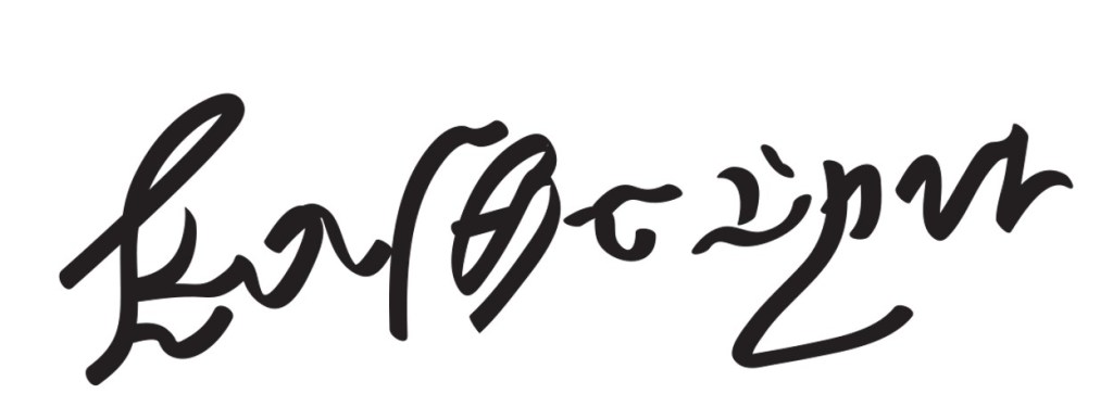
The above elaborate writing is by Anne/Anna of Cleves. She was the one that got away in that Henry had the marriage annulled because he thought she wasn’t as attractive as her portrait.
The name Anna is printed in capital letters – not only that they are embellished in a quite elaborate way.
Using capital letters can have a couple of different meanings. One is that it is deceptive – they are hiding something because you can’t pick up so much from printing. The other is that they are trying to be clear. I think it is probably the latter in this case, because it’s not all in capitals and the rest of the writing is pretty hard to read.
However, the elaborate decorations adorning the letters could show an obsessive/compulsive personality, or possibly an artistic bent.
The letters slope erratically, showing a changeable, moody personality. I can see a couple of clear communication letters, though, indicating she was a good communicator.
Finally, this a Katherine Parr’s signature, Henry’s last wife, who outlived him. This shows a confident hand. The enormous height on the first ‘K’ shows an arrogant person, who is full of themselves. The elaborate underline reinforces that.
She otherwise has a fairly legible hand, showing an open, honest nature.
The zones are probably the most equal of all the signatures in this post, showing quite a well-balanced person.

Leave a reply to jay Cancel reply