To conclude our series on royal graphology:
1.William Hastings
First of all you can see that this is quite a flowing signature with a lot of nice curves, not many ‘angry’ sharp top angles to the letters. This shows he was generally an affable, non-violent person, at least while he was writing this. His middle zone seems the most dominant – as many of these signatures have been – showing his concern with material things, prestige, self-importance and living in the moment.

Looking at the lower zone, he has quite an elaborate curl on the ‘g’, with the curl turning back to the left, in contrast to the ‘y’ which curls to the right. This suggests he might have ‘swung both ways’ when it came to sexual partners, which is possible considering his reputation for debauchery at the time. Note the phallic symbol in the ‘h’, indicating kinkiness!
In general the signature is legible with a slant to the right, indicating sociability.
His upper zone is pretty small, showing he wasn’t concerned with intellectual matters , nor was he a dreamer.
The end downward stroke, which doesn’t seem to represent any particular letter, suggests a dagger to me, perhaps the cause of his downfall.
- Anne Neville
I was quite surprised that Anne’s signature is not particularly legible (although not as illegible as Margaret Beaufort’s for instance), but perhaps it’s not surprising that she might feel the need to hide herself away, after some of the experiences she had (married young, widowed, hidden away by George, etc). She would not have revealed her true feelings easily. It seems to me her first name is easier to read than the surname (which I think is Warwick rather than Neville, though I could be wrong) and I take this to mean that she reveals more to those who know her better and more familiarly, as many people do.
She has a normal lower zone, showing a balanced and healthy sex life.
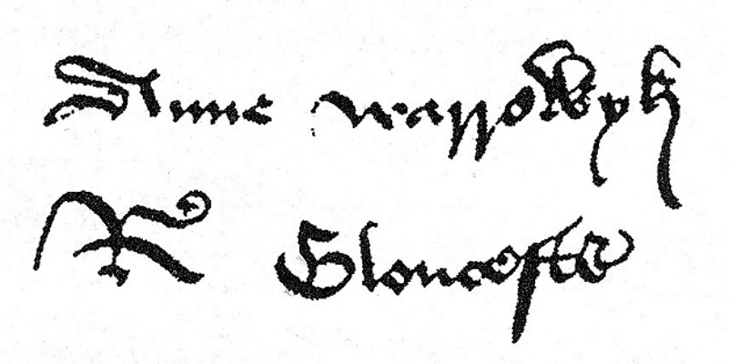
However can you see the similarities between hers and Richard’s signature, that suggest to me they were compatible and on the same wavelength?. They both have balanced zones – pretty equal in size – showing well-balanced personalities.
They also both have upright letters, which show a need for control and particularly self-control. They are of similar size, his slightly larger, which would not be surprising considering that men were dominant in those times. It shows that he considered her to be more or less his equal and reveals his respect for her. Compare the signatures of Henry VII and Elizabeth of York where his dwarfs hers. Who do you think was the dominant personality here?
3. Anthony Woodville
Well, this is a mess! As most of it is in upper case letters, it is hard to judge the zones so well, but can you see he has extended the vertical stroke of the ‘L’s so they are higher than the rest. He was meant to be an intellectual and well-read man, but his writing suggests to me that he wanted to be perceived as such more than actually being so, because the ‘L’s should not be taller and are therefore forced. But I could be judging him a bit harshly. His signature is not as clear as Richard’s or Clarence’s or Hastings’, but is decipherable more than Margaret Beaufort’s. There are no lower zone letters, but the upper and middle zones are more or less equal in his signature, so I think he was more intelligent than his sister, Elizabeth.


There are no communication letters here but the ‘v’ and ‘s’ on the end are closed (when they needn’t be) suggesting a secretive nature.
The first example, with motto, looks very controlled to me and as I believe it was written when he was awaiting execution, it is understandable that he would be desperately trying to hold onto his emotions. The upper case letters support this conclusion.
The lower signature is all over the place as regards slant, showing an unpredictable and mercurial personality.
He underlines the first one in a flamboyant way which suggests he wants attention – perhaps he doesn’t like to think of himself being forgotten after his death. The ‘x’s in the underline show his preoccupation with his demise.
- Thomas Grey
This is the signature of the son of Elizabeth. The zones are quite well balanced and the letters are upright, showing strong control over his emotions. The communication letter ‘o’ is open at the top, suggesting he was a big talker and couldn’t keep a confidence.
The letter ‘s’ (or ‘f’ as it appears) spans all three zones, but the upper zone is broken – perhaps he had a headache or an injury, but the signature as a whole is messy, suggesting he was also untidy. The ‘t’s are crossed very firmly and the cross stroke extends far to the right, showing a forward-thinking person.
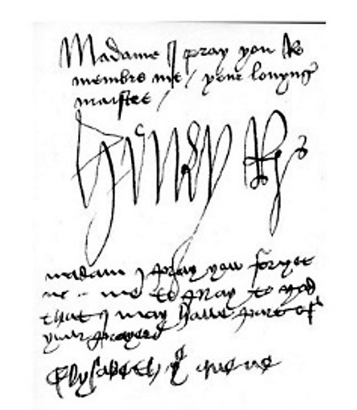
5. Edward V
This is the signature of Edward which appears alongside those of Richard and Buckingham. It is spidery and childlike, although legible. There is no curl in his lower zone which is perfectly to be expected as he was only 12 at the time.
The writing looks a bit shaky, suggesting he was nervous (understandable given the circumstances) or possibly unwell. The downward-pointing cross stroke of the ‘t’ in quintus could show a control freak, but I think it also suggests a depressed or pessimistic nature, but that could be because his father had just died.
It is interesting that the tops of the letters are more rounded than the lower edges. I don’t know what this means for sure but my intuition suggests he would have appeared softer and more easygoing on the surface than he was underneath – a hidden ruthless side. This is reinforced by the open bottomed ‘a’, which shows he could verbally argue his case – eat you up and spit you out – and wasn’t above using deception to achieve this. And see the dot of the ‘i’ which is more of a dash or a slashing stroke. This shows frustration and irritability.
- Henry VI
Henry VI was a weak king, as we know. We can see in his signature that there is a softness to his nature and that the very large upper zone shows he was intelligent but can also mean a dreamer or someone who has his head in the clouds. He had his head in heaven!

The upper and lower zones are roughly equal, showing he had a normal attitude to sex, perhaps surprisingly. However, his middle zone is the smallest which indicates he wasn’t concerned with everyday life, material possessions or his appearance.
It is upright, showing that he had strong control over his emotions and he was not at all deceptive.
Unfortunately it is the only sample I could find, and there isn’t really much else to glean from it.
- John Howard, Duke of Norfolk
‘Jocky’ of Norfolk, well, it looks first of all as if it is sloping slightly upwards, suggesting optimism and an upbeat nature. The slant varies, showing a changeable character.
The middle zone is most prominent, indicating the need for outward trappings of success, material possessions, as in many of the other hands I have looked at.

Look at the wide open ‘o’s, especially the first! I wouldn’t trust him with a secret, I would think he could be indiscreet and a big talker or perhaps the sort of person who opens his mouth and puts his foot in it!
There are a combination of rounded and sharp strokes showing he could be kind and thoughtful, but also hard and stern when needed.
I wouldn’t think he was particularly intellectual, nor was he very sensual, but that could have been his age – I don’t know how old he was when this was written.
There are a few tick marks on the beginning of the ‘n’ and ‘r’, which shows he could fly off the handle quite easily – you wouldn’t want to cross him. His signature is neither very obscure nor very clear, suggesting he could dissemble if required.
I get the impression of a person who was quite modest in himself, shown by the small initial ‘j’ and ‘n’ of Norfolk.
- John de Vere, Earl of Oxford
Here is a signature from the Earl of Oxford, the nemesis of the Yorks, out to get revenge for the death of his father.
It is absolutely clear and easy to read, and seems to have been done with control and care. And look at the sweet little flower – but what is that loopy thing below it? Could it be a phallic symbol? This shows the willingness or need to break social taboos. Possibly gay? It would have been a big taboo in those days.
The zones are even, showing a well-balanced personality, which is quite surprising considering his reputation. However it could be seen as too perfect, which can show deception – a person disguising their natural way of writing and wanting to appear perfect.
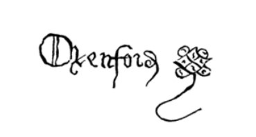
It is quite rounded and flowing and quite upright. This means he was sociable and unwarlike for the times – I think he was pushed into the whole war thing and he would have preferred a peaceful life. But the heavy line of the ‘f’ look like a dagger, so he could have been violent when needed. The lines through the ‘O’ , obliterating the clarity of the ‘O’ could show a forked-tongued liar – notice the extra little line in the second ‘o’ too.
9.Thomas Howard, Earl of Surrey
Well this is a flamboyant signature! This is Jocky Howard’s son, Surrey.

It is large and suggests the writer wants to be noticed, likes attention. The middle zone is huge, showing a preoccupation with himself and his immediate needs, outward show and possessions. The signature as a whole is huge, compared to the writing above. In fact when you look at the writing, the upper zone is more emphasised, showing he was quite intelligent, but didn’t show it to everyone, perhaps wanting to fit in with the court life where show and prestige was everything. I think this shows the writer felt inferior and is putting on a show of confidence – the whole thing screams over-compensation.
There are tick marks and angularity suggesting frustration and a temper.
Look at the lower zone – either this is another sign that the Earl of Surrey is overcompensating or he is gay – the tail of the ‘y’ goes way over to the left, suggesting the latter, as does the little flower sign.
Not sure what those unnecessary two dots are between the ‘T’ and ‘h’ but it could be another cry for attention.
- James Tyrell
I really like this signature. Tyrell was one of Richard’s men who was rewarded by him for unknown services and who was tortured and executed by Henry VII. Here the signature suggests a very optimistic and positive person – very sociable. See how the writing slants to the right and slopes up? Also there is not much space between the two names, suggesting he liked to be in the company of others.
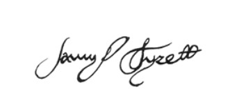
The signature is well balanced and has equal sized zones. It is also fairly clear and easy to read, showing a lack of dissimulation. However, the ‘a’ shows he could keep a secret when needed and the line through the two ‘l’s at the end look like eyes to me. Was he one of Richard’s spies?
Now, I have been thinking about the proliferation of phallic symbols in many of these signatures and the conclusion I have come to is that they were probably not overly perverted or sex mad (with a few notable exceptions!), but that they may have felt guilty about their sexual feelings because of the strict doctrines of the church in regard to these matters. So crossing the boundaries of the sexual norm of the times, might only have been ogling women, visiting prostitutes or an affair or two. I’ll leave that to you to decide.
- Richard Neville, Earl of Warwick
Finally, let us look at Richard Neville’s signature. The first thing I notice is that it is hard to read and slopes uphill more than any of the others. I think he was the eternal optimist and supremely confident in himself that things would work out for him.

It is a firm and confident signature and this mirrors the man himself. He was certainly capable of deception as he pretended to be supporting Edward and was actually plotting against him – we can tell this because his writing is also deceptive with it being difficult to decipher. And his closed ‘a’ shows he can keep his mouth closed.
The varied slant of the letters shows another volatile, changeable character and the hard down strokes reveal he had a bad temper at times.
See the definite tick mark on the ‘R’ – he was certainly a person you didn’t want to upset.
There is the ubiquitous phallic symbol, and we know he did have an illegitimate daughter. However do you see the break in the loop of the ‘y’ and also in the loop in the little logo thingy at the end? This shows there was a trauma of some kind, either physical or emotional regarding his sexual organs, sex life or lower body. We do not know if this was the case, but we do know that Warwick had no sons, so he may have felt subconsciously that he was inadequate in some way because of this. Both sexes can have this – for example a woman can show this sign if she has had a hysterectomy or has lost a lover. (In fact Henry VII has breaks in his lower loops as well).
I think, like Edward, he was also a ‘boob’ man – the rounded part of the underline and the shape of the letters above it suggest that.
What about the little end doodle? Well, it might be a device or coat f arms badge, or perhaps it is the crown that wasn’t his but that he bestowed on two kings, as Kingmaker. 😉
- Francis Lovell
Richard’s best friend – I found this after I had posted the draft so I had to include him!
Well, the zones are of equal height, which shows he was a well-balanced guy emotionally. He has a legible, clear signature – no deception there, and his communication letters, ‘a’ and ‘o’ are also clear, well-formed and closed normally, meaning he was a good communicator and could be trusted to keep a confidence.

You can see there is a mixture of angular letters and rounded ones, showing he could have a tough side as well as a softer one. There are some heavy downward strokes on the first letters ‘ff’ which shows he could have a temper at times.
The slant is just slightly to the right, which indicates he was fairly sociable, and likewise the two names are close together, suggesting he enjoyed the company of others.
I’m not sure what the final letter/squiggle is nor the extra thing in the middle joining the ‘s’. These extra unnecessary bits might mean he was a bit obsessive compulsive. I would think that both he and Richard were tidy and neat, so this might have spilled over into OCD.
These analyses are, as I said before, just for fun and of course I am a little biased, I have to confess. Also, most of my subjects here are confined to just one signature, which is limiting and cannot be relied upon to be as accurate as if there were more samples.
However, on the whole, do you notice how much more well-balanced, rounded and ‘normal’ Richard’s and his friends’ signatures were, in comparison to most of the others?

Leave a reply to hoodedman1 Cancel reply