I have recently reread an interesting book about analysing handwriting and have had fun playing about with my friends’ writing and seeing if their handwriting matches their characters; it mainly does.
So, being interested in Richard III, I thought I would (just for fun) have a go at analysing his writing at different times in his life and see if I could get any insight into the man.
I know there have been others who analysed his writing, one of which I know concluded that he suffered with depression. I have used what I learned in the book (link to follow) but also added some of my own thoughts. There are some aspects which puzzle me and I will leave these open for discussion. First of all, let me make it clear, once again, that this is purely for fun. Also, you will understand that, as mediaeval writing differs quite a bit from modern writing, there are some aspects which might be confused or difficult to interpret because of that. For example, the letters are generally written in a more angular way, in that the rounded letters (a, o, p, d, etc) are squarer. Perhaps this is because of the writing implements used, but interestingly, the more sharp and angular the writing the less soft and more aggressive the character is. Well, we all know what a generally violent and aggressive period of history it was; maybe their writing reflected that.
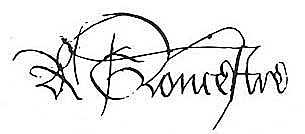
Looking at Richard’s writing, let us first examine his earliest known signature, written in about 1465, with the motto ‘Tant le Desiree’ in one of his books on chivalry.

We can see the angular ‘o’ I mentioned and the generally angular script, but I think it is quite a flowing hand compared to some others of the times, which suggests to me that Richard was more merciful than the norm. The signature is larger than the rest of the writing (which is about the same size as the motto), showing that Richard was confident in his own identity and importance. Another obvious aspect of this signature is that it is very clear and legible. We all know people who sign their names illegibly, and it was no different then. Just look at this signature:
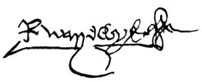
Can you decipher it? I will tell you whose it is later. But returning to Richard, the legible nature of his signature shows he is not hiding anything! If you disguise your signature you are trying to hide an aspect of yourself. Richard’s is very much ‘What you see is what you get’. See the way he has crossed the ‘ts’ in ‘tant’ from the vertical stem more to the right than the left; as we write from left to right, left corresponds to the past, which suggests that he is forward thinking rather than dwelling on the past, or he might prefer not to think about the past.
Notice that the level of the writing is slightly upward moving (as is the second signature), showing, far from depression, a positive outlook. This can change according to one’s mood. Check you own writing the next time you feel down to see if it is going downhill too.
There is quite large spacing between each word and between the ‘R’ and the ‘Gloucestre’, revealing that Richard needs to be alone at times.
Look at the clear ‘o’s and ‘a’s in his writing – they are the communication letters. They are clear and well-formed, and firmly closed. This means Richard was a good communicator and that he was the kind of person who could keep a confidence.
Now look at the hard, heavy downward stroke of the ‘s’ in Gloucestre; this shows he could have a temper at times.
Looking at the upper zone (where the tall letters and capitals extend above the level of the ‘o’s and ‘a’s), they are generally more than twice the height of the ‘o’s – this shows his intellectual abilities, which must have been considerable.
Now, in the book the author is mainly analysing criminals’ and murderers’ writing and she comments that often their weapon of choice appears in their writing subconsciously. Since we know that they all had weapons and it was very violent in those times, I suppose it’s no surprise to see weapon-shaped letters in Richard’s writing (as in others’ of the times): look at the ‘s’ again, in Gloucestre – does it look like a dagger? But what is that little scribbly thing at the end? A flower? A rose? Considering the nature of the book it appears in, perhaps it’s a lady’s favour on the end of a lance?
There are no lower zone letters present in this snippet (I’m not counting the ‘s’ since it doesn’t go below the line in modern script, nor does it have a ‘tail’, like a ‘g’ or ‘y’), so I am unable to analyse his sexual inclinations at this juncture.
Let us move on to the next sample:
Here, we see his signature is more confident and firm, but look at the huge space between the ‘R’ and ‘Gloucestre’! He has a great need for solitude, reinforced by the greater spaces in the bulk of the P.S. than in the main part of the letter (written by a scribe or secretary).
His high intellect is still apparent, shown by the long ‘l’ in Gloucestre and the high part of the ‘u’s. Here we can see his lower zone (lower parts of ‘g’ and ‘y’) and it balances out the higher zone well, showing he had a keen interest and capacity for sex. As he was about 16 or 17 when this was written (1469), it is hardly surprising!
His communication letters are again well-formed and clear and his signature legible. His signature is about the same size as the rest of the letter, showing he was no arrogant or considered himself superior to the recipient.
Look at the ‘p’ in ‘pray’; can you see the down stroke which extends above the rounded part of it? This is called a ‘pugilistic p’ and indicates an argumentative nature. We know he argued eloquently against his brother George over his marriage to Anne and the Neville estates, so this is probably correct.
See the letter ‘I’ – this is important as ‘I’ represents your own identity and can reflect your relationships with your parents. The upper part of the ‘I’ represents the mother relationship and the lower the father link. As you can see, Richard’s upper part of the ‘I’ is large and curved, showing he had a normal and positive relationship with his mother, but the lower part is minimal and dwindling off, which indicates a distant or unknown father – we know Richard’s father was killed when he was eight, so he wouldn’t have had a deep relationship with him.
Next sample:
This occurred in 1471-75. By this time, Richard had fought in two battles and been wounded himself. He had considerable success in this and this must have increased his confidence, – see how large his signature is now?
Also, note the large ‘X’ over the letter ‘G’ in Gloucester? There are also other, less distinct ‘x’s in the ‘R’ and the ‘st’ combination. ‘X’s in the signature indicate a preoccupation with death. After his experiences in the bloody battles and subsequent executions of Barnet and Tewkesbury, is it any wonder death would be an ever-present thought and fear? You will find ‘x’s in many mediaeval signatures, which should surprise no-one, as death was always just around the corner then, and not such a taboo subject as it is now.
Additionally, you can see his ‘R’ and ‘Gloucestre’ are closer together than before and his letters are leaning a little more to the right. This indicates that he was happier in company with others now – perhaps because of the camaraderie of the soldier?
The ‘o’s are still clear, his communication skills undiminished and direct. However, the signature as a whole is a bit more indistinct and, though not illegible, it is more difficult to decipher. Is he learning how to keep back certain parts of his persona? Finally, look again at the initial ‘R’; does it remind you of an axe? A battleaxe? An executioner’s axe? I’ll leave you to draw your own conclusions about that!
Next, from 1478:
This is essentially very similar to the previous one, but note the broken line in the top of the ‘G’? I think he was suffering from a headache when he wrote this.
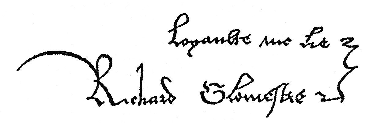
Next, from ‘that time’ in 1483, this was the signature which was one of three with Edward V and the Duke of Buckingham:
This signature is notably more legible than the previous few and includes his first name. Also apparent is his motto, Loyaulte Me Lie, which we all know. This shows he was sincere and open – we are back to ‘what you see is what you get’.
His communication letters are still clear; his signature is not much larger than the motto, showing his lack of any great ambition.
Note the bracket/squiggle connecting the motto and the name, reinforcing the link and underlying the fact that this motto is sincerely held by Richard. Plus there are no ‘x’s or ‘axes’.
However, look at the ‘m’ in ‘me’ and the ‘h’ in ‘Richard’ – see the extra strokes on the left side of them? They are called tick marks and can indicate a person who can fly off the handle easily.
Hard to miss is the long, curved stroke leading to the left on the R of Richard. As we write from left to right, the left indicates the past. Strokes such as these, which lead back to the left mean that there is something in a person’s past that they can’t let go of and which still influences them in the present. In Richard’s case it is likely to be the deaths of his father and brother, Edmund, and his own swift exile with his brother, George, when he was just eight. It’s not really surprising if such a traumatic experience would still haunt him.
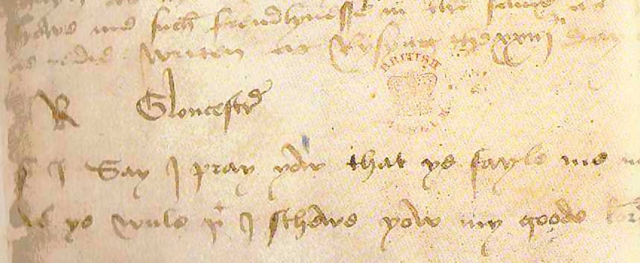
The next samples are from when he was king. Here is the first which is from his letter to the Archbishop asking for the seal so he can put down Buckingham’s rebellion. He wrote the postscript himself having found out about Buckingham’s betrayal and is the one where he calls him ‘the most untrue creature living’.
The first things to notice are the large numbers of heavy, downward strokes which indicate his anger – he was furious! I don’t know if the ink blots were his too, but if they were that serves to reinforce the violent emotions coursing through him. There are also pugilistic ‘p’s and resentment marks galore too (look for extra strokes at the beginnings of letters that shouldn’t have them – ‘m’s, ‘h’s, ‘y’s, ‘n’s).
I think he was writing quickly and urgently, which has made the writing much less legible than normal for him.
His usual script shows great self-control and I think he ‘lost it’ here.
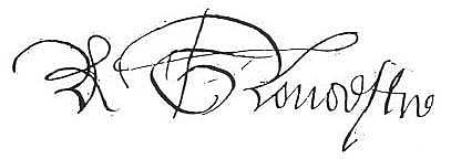
Next, from1484 – A Venetian document:
See how large and showy it is – it is for public consumption and he wants to be perceived as powerful and strong.
The ‘axe’ is back! He is not to be trifled with.
The communication letters remain clearly defined and his intelligence is again emphasised. The upright nature of it shows he is again in control of himself.
Next:
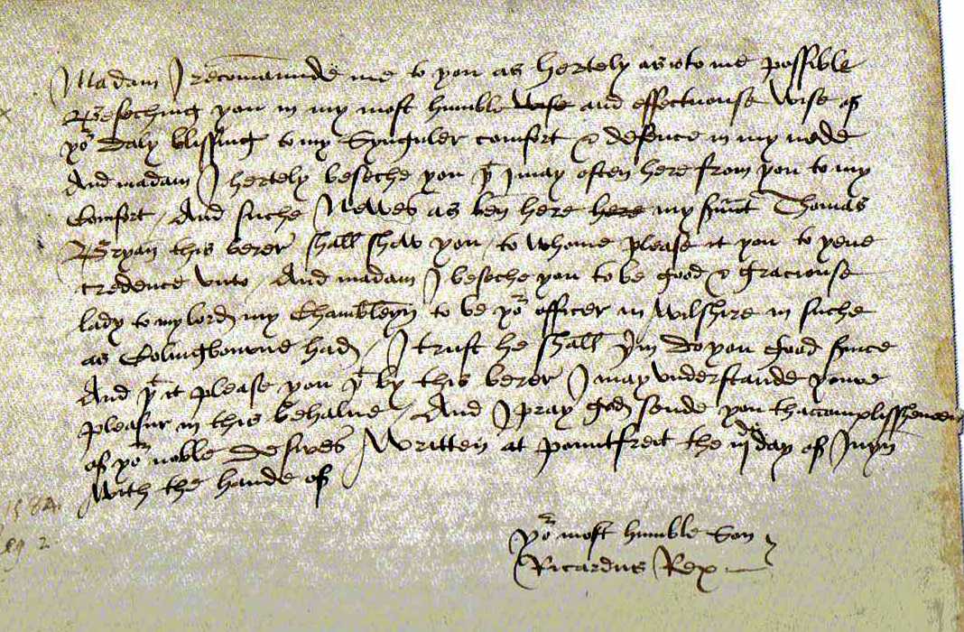
See the difference here; the signature is much smaller and less angular and the letters are of more consistent size. This is a private letter he wrote to his mother Cecily.
I believe he loved his mother, indicated by the rounded, flowing writing.
He also respected her, because his signature was the same size as the body of the letter – he signs himself ‘your most humble son’ and again links this to his name – he means it – his signature is humble.
And see the ‘I’s again – look how large the loops are coming down from the top (the mother area): they come right down into the father area, perhaps showing that his mother is all he has left – his father is gone and she represents both parents.
The words are now very close together and leaning more to the right – he is close to his mother and shows his feelings more with her.
There are still some tick marks, but I feel this is a general thing with him – he had quite a lot to irritate him by this time so it’s no wonder he could be irritable at times.
I don’t see depression even here – the lines of writing are going uphill rather than down. The pressure is even, showing no anger here.
He mentions Collyngbourne, (fifth line up from the bottom, on the left) who was hanged, drawn and quartered for treason – do you see anything like a scaffold in his name?!
Well, that is my interpretation for your entertainment – as you can see I have used my imagination and intuition a lot. Perhaps you can notice some other traits in the various samples – if so, please comment.
Oh and who was the second signature? It was Richard Neville, Earl of Warwick.
The book I enjoyed reading about analysing handwriting is: Sex Lies and Handwriting
Apologies to the author if I have misinterpreted anything and I heartily recommend it to anyone interested in the subject.

Leave a reply to Signs of the Times 5 – The New Murrey and Blue blog Cancel reply